Cheshire Ireland
N O T - F O R - P R O F I T
Cheshire Ireland
Brand Refresh | Website Design
Context
Cheshire Ireland is a not-for-profit healthcare organisation that provides mainly residential support to people with physical and neurological disabilities so they can live life the way they choose.
The Task
Cheshire Ireland had long outgrown their old identity and online presence. While their brand clearly needed updating, the real challenge was to design a brand identity that would rebuild a connection between the brand and all members of the organisation and inject them with renewed energy for growth.
The Result
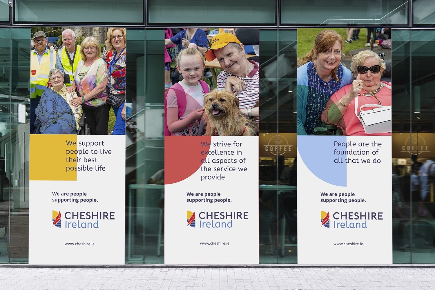
This project was about people. The new brand identity needed to convey the essence of Cheshire Ireland, highlighting their positive internal culture and reflecting their brand vision and values.
_Logo & Brand Identity
With great sensitivity for their long history we created a punchy new logo that radiates energy, positivity and happiness. It draws you in, engages people and lets you know something good is happening! We reimagined their iconic red feather and infused the new brand identity with warmth and vitality by introducing a vibrant colour palette, tailored iconography, and carefully curated imagery that together generates a new look throughout their communications. The detailed brand book we provided ensures consistent brand application.
_Website & UX Design
In parallel we created a modern website with a very user-friendly interface that clearly meets the needs of Cheshire Ireland’s various stakeholders: service users and their families, staff, volunteers and the HSE. For the first time visitors to their website can now easily find out about all the different service facilitites available across Ireland. Its clear site structure helps to create trust and positions Cheshire Ireland as the partner of choice for its service users. In addition their new responsive website is scaleable and provides a solid platform supporting future plans.
“Their ability to listen stands out, but beyond that, I was impressed by their ability to hear what we wanted, even if we weren’t quite sure ourselves. They read between the lines and came back with suggestions. They’re very skilled at this. I found them incredibly respectful and ethical, both personally and professionally. They were always concerned with getting the job right and making sure we were happy. It was a pleasure to work with them, one I’d repeat without a thought.”


